(604) 837-9447
info@donkeyink.com

A few refreshments and napkin scribbles later we decided to do some creative things together…
As brand experts, Donkey Ink & Digital, or DID, has had the privilege of working with many respected brands and businesses of all sizes, and we specialize in working with small to medium sized organizations.
What you’re seeing here is completely made by humans. What you won’t see here are generic designs created by AI. While we use some AI features baked into the software we use, we don’t let robots do any designing.
This is a no-robot zone.
Whether you require a new brand from the ground up, already have one and require a complete overhaul, or simply require branded marketing assets for a marketing campaign, we’re here to help with an approach that involves listening to your needs, collaborating on concepts, and delivering stunning results on time and on budget.
Whether you’re just starting out or already have a foothold in your local market, it’s important to assess your brand image at regular intervals to ensure it’s helping you grow and not hindering your ability to scale.
We’ve developed a Brand Assessment Checklist so you can assess different aspects of your brand. Take the test today to see where your brand excels, or where it can use improvement.
Donkey Ink & Digital was responsible for the Pace Solutions rebranding from the ground up. The response has been wonderful. We’re now one of the strongest, most recognizable brands in our industry.
WES MARTIN
President
Pace Solutions Corp.

Serving industries throughout North and Central America, Pace Chemicals decided they were more than just a chemical company. In addition to manufacturing and distributing chemicals, Pace also offers complete programs and solutions aimed at water treatment, horticulture, and energy efficiency. They had outgrown the existing brand and so a new visual identity was required.
Pace Solutions Corp. (Canada) and Pace Plant Health Advocates (US/Central America) were born.
We worked closely the Canada and US based stakeholders of Pace Solutions to create a new visual identity that reflected their programs and solutions in a uniform voice. Our main focus was Canada. The strategy included a far-reaching marketing and PR strategy focused on essential products and programs, and overall brand awareness.
Since the launch of the new brand, Pace Solutions has become recognizable as Canada’s premier business in its field. It’s grown from a two-office, 30-employee western Canada business, to a national, 10-office, 100+ employee organization.
Scroll through the tabs above to see the assets forming the basis of the Pace Solutions brand and view the interactive Pace Solutions Brand Guide here.

Pace needed a visual identity that reflected its Canadian and US/Central American companies and the many divisions within each. The logo had to carry a uniform look, and aesthetically appeal to customers in each unique industry Pace serves. The multicoloured plus sign logo mark not only visually represents each division but also brings to life the company’s mission of assisting customers achieve their conservation and environmental sustainability goals.
A brand guide was produced to guide those working with the brand assets internally and externally as to how (and how not) to use the various assets. It outlines usage for logo assets, colour palettes, typography, and more. View the interactive Pace Solutions Brand Guide here.
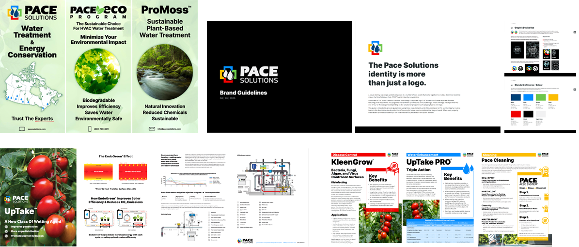
Attending several trade shows per year, engaging in a relationship-driven sales strategy, and serving dozens of distributors had Pace Solutions required a fair amount of hardcopy collateral throughout the year both internally and for its cliens. Designed for both print and digital, and featuring our detailed infographics and custom iconography, these pieces were created to be concise, versatile, visually appealing, and platform agnostic.
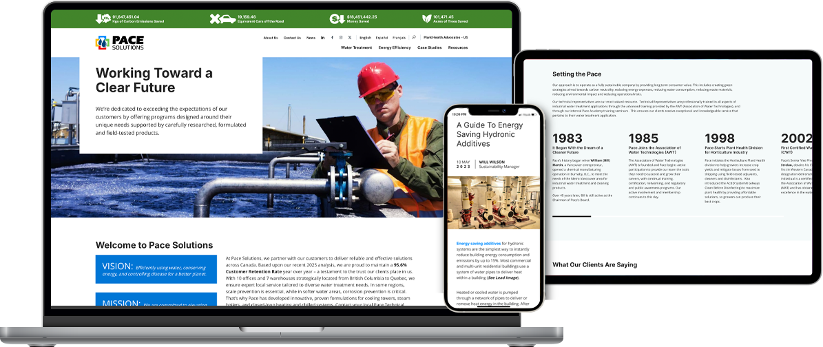
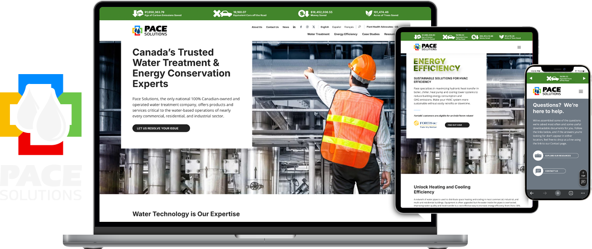
During the course of the 17 year relationship with Pace, we designed and built 4 different websites for the Canadian sector of their business. The current Pace Solutions website was built to stand out in their industry by presenting visitors with stunning design and solid information while ushering them through a consistent brand journey. From the curated dropdown menus to mini Obstacle/Solution/Result case studies for every service and product, each element is unique and deliberate; aimed at enhancing customer discovery and encouraging contact.
The SEO efforts allowed Pace to analyze how its users interacted with their websites, then tailor their marketing efforts based on this data. Ongoing site optimization efforts ensured the code behind the website was always healthy and up to date.
Additional digital assets included social media cards, and landing pages featuring prominent calls to action.
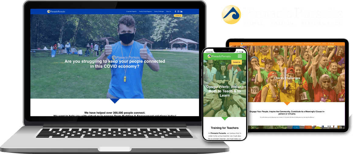
Since 1997, Pinnacle Pursuits has been organizing award winning experiential leadership programs and large-scale team building events and adventures for fortune 500 companies, educational institutions, and charities in 11 countries. The company needed a new website that not only provided visitors with easy access to information, but a portal from which they could enrol in and pay for access to activities and events.
A clean, modern, and responsive website was produced with a clear user flow so visitors could quickly and easily find what they came for. They were also now able to learn about, enrol in, and purchase attendance to any of its extensive catalogue of activities and events.
Once launched, Pinnacle reported a drastic reduction in drop rate and an increase in pages per visit. After booking 3 successful summer camps with dozens of paying participants, Pinnacle was extremely happy with the functionality and user experience of the customized tool.
Scroll through the tabs above to see the different aspects of the Pinnacle Pursuits websites.
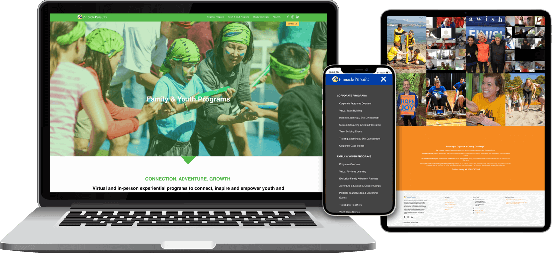
The goal was to improve the user experience, provide clear messaging, and organize the program catalogue. The landing page builds excitement, shows critical partnerships, and easily directs visitors to core programs. The positive energy at the heart of the company’s culture is retained throughout. Visitors enjoy simple navigation with no hard-stop pages and a clear call to action from any point. Forms and programs are easy to find from desktop to tablet to mobile. With a modular backend, pages are easy to update and change.
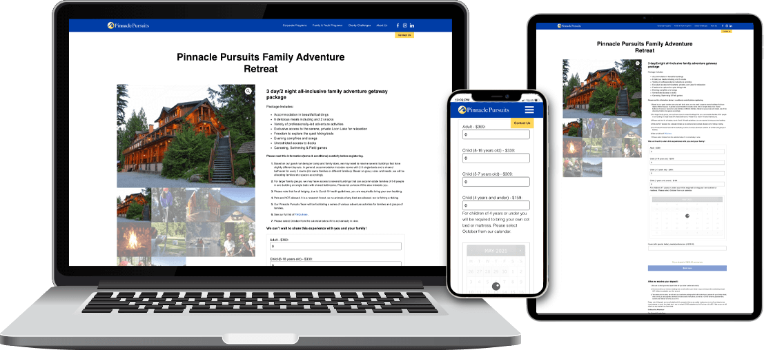
The big challenges were the booking system and making viable remote programs for educators and participants. It became quickly apparent that these elements needed to be customized to the unique needs of Pinnacle. The easy-to-use system successfully accepted and tracked deposits, charged balances, provided automated confirmation, and communicated with participants.
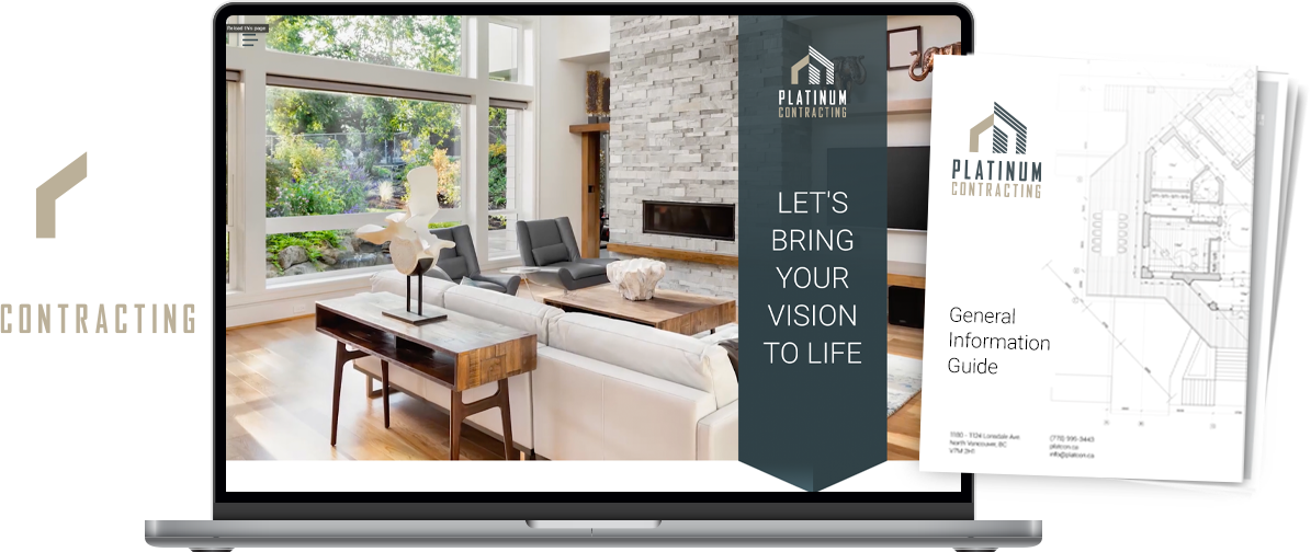
Platinum Renovations & Contracting was growing, and fast. Previously only a boutique renovation company, they were now expanding into home building as well. It was time for a rebrand that maintained a boutique aesthetic.
They shortened the name to Platinum Contracting. The rebranding included messaging that lets their target market know Platinum can handle everything from a simple bathroom renovation to a full house build. They wanted to let people know that what set themselves apart was dealing with clients directly––the decision makers are answering the phones––and offering top notch customer service.
Using the new website in their applications, Platinum Contracting was able to receive award nominations and association accreditations. They have been consistently booked from a year to 18 months in advance.
Scroll through the tabs above to see the assets forming the basis of the Platinumc Contracting brand.

Platinum Contracting already had a logo. We simply gave it a bit of tightening up and offered a horizontally formatted version for them.

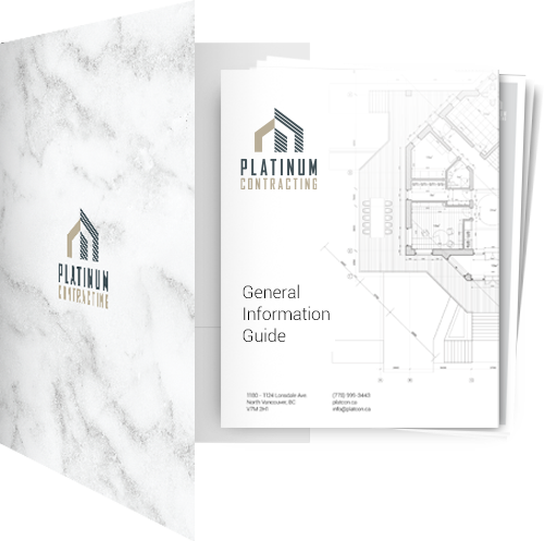
Platinum Contracting had customer facing documentation offering a bit of insight into what to expect when working with them, and some helpful information about material suppliers. They wanted a visually compelling way of presenting the document itself, and offer their clients a way to keep all hardcopy documentation together during the course of a project. For this purpose we produced a presentation folder, into which we placed the newly redesigned and renamed General Information Guide.
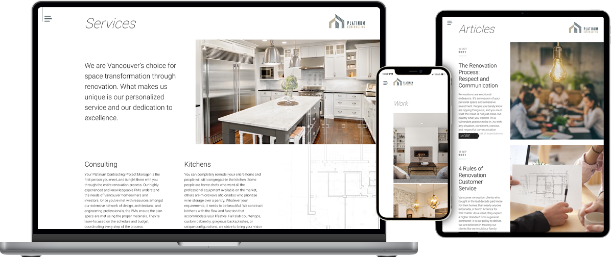
When we started discussing the new Platinum Contracting website, it was apparent they wanted to set themselves apart from others in the field within the digital realm, just as they have with the work they’ve done for their clients.
When one first lands on the home page, scroll-dependent content creates an engaging experience that immediately invokes a sophisticated impression. The site doesn’t just revolve around the company, but also acts as an informative resource for those thinking about renovation and construction.
*Note: The site in the link above is the one we built for them. They’ve since had a new site built.
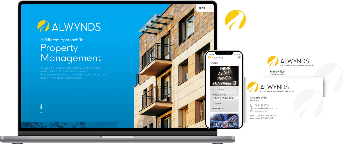
Alwynds Property Management is a new business that began with the realization that something new was needed in the business of property management. They had an idea that a boutique property management business model would allow for more attention to property owners’ and tenants’ needs. It was time to launch a new brand.
After looking at competitor property management companies, we wanted to ensure that with this new brand the industry standard corporate look needed to be replaced with something artful with solid messaging that speaks to landlords and tenants alike.
The new brand, with an easy to navigate website at its core, took off within 6 months from launch. At this writing, they are currently now managing over 50 properties.
Scroll through the tabs above to see the assets forming the basis of the Alwynds brand.

When asked about the things Alwynds wanted to incorporate into the visual side of their brand the key concepts were ‘looking forward,’ and ‘stability/security.’ Early on it was decided we’d use the logo mark (or icon) to represent the first concept, and the logotype (or word mark) to represent the second.
The logo mark is made up of a ‘sun’ as the backdrop, and a winding road that symbolizes the way forward. The road can also be interpreted as a stylized lower case or capital ‘a’ to represent Alwynds. The logotype is a custom typeface with solid, upright, upper case letterforms that offer a rigid (or stable) contrast to the more flowing logo mark.
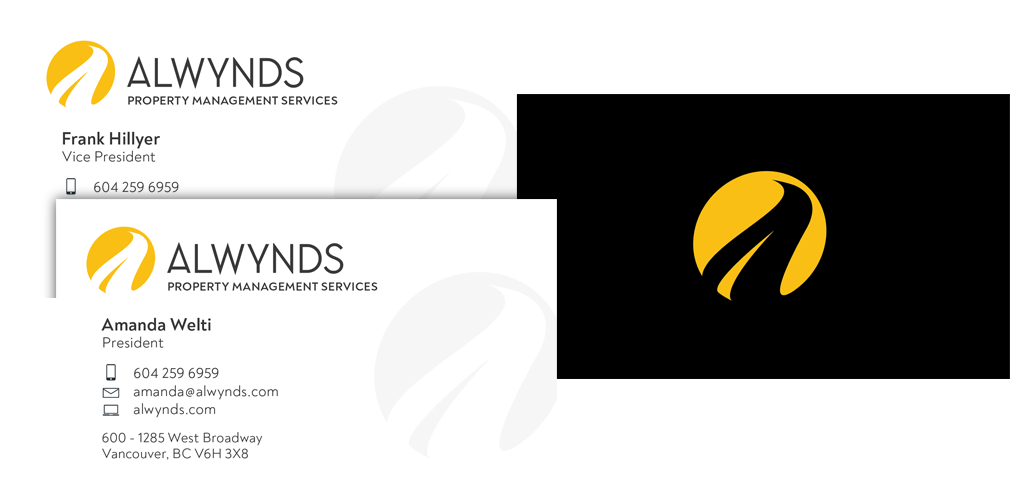
Nothing on a screen can capture the impact of a well produced print piece. These cards are no exception. The final printed product uses a gold foil where the yellow logo mark appears, and the grey versions aren’t actually grey, but rather indicate where only a glossy spot gloss was applied. The varnish catches the light and adds a sense of depth to these cards.
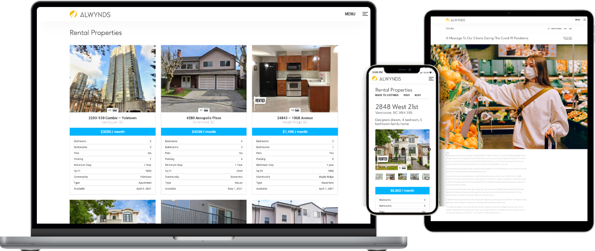
The design style of the new Alwynds website captures the culture and lifestyle of Western Canada; both important elements in property management considerations. Simplicity was the core concept on which the site was designed. Users are ushered through an experience that quickly directs them to the information they desire. Visitors are presented with critical property listing data, informative articles, various resources, and a clear explanation of its services.
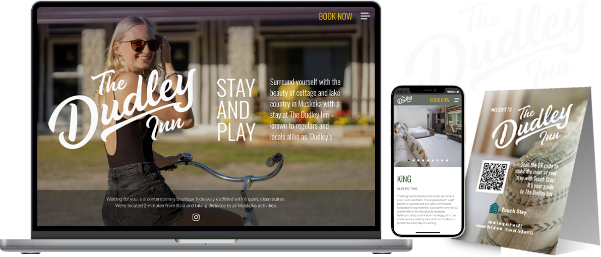
The Dudley Inn was built in Bala in the Muskoka area of Ontario in the ‘80s as Dudley’s Inn. This six room boutique motel was made from poplar trees harvested on the property. This creates a rustic feel inside and out of the comfy rooms. The new owners bought and renovated and decided to keep the name and tradition alive with a rename to The Dudley Inn. This of course required a refresh of the brand.
After the renovation, there’s now a balance between nostalgia and modern amenities. The new visual identity was meant to capture this balance while also reflecting the balance of nature and activity in the surrounding environment.
After the renovations, and with part of the rebrand including an online booking system, this inn nestled in the trees in Bala is fully booked for entire seasons.
Scroll through the tabs above to see the assets forming the basis of the Dudley Inn brand.
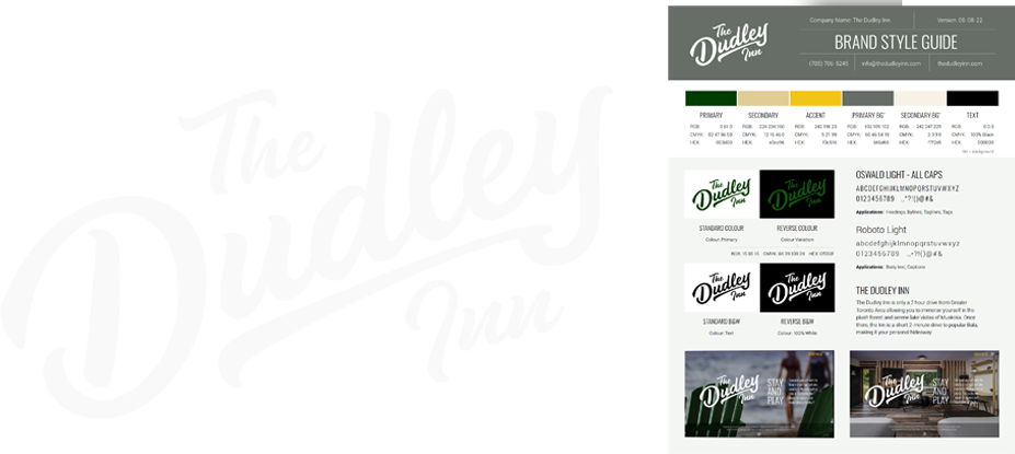
Inspired by a number of different Canadian brands, it was decided a traditional looking script typeface would be the order of the day for The Dudley Inn‘s logo. This logo will appear on apparel in the near future, in addition to the print applications mentioned here. An informative, single-page brand guide was also provided to ensure brand consistency.
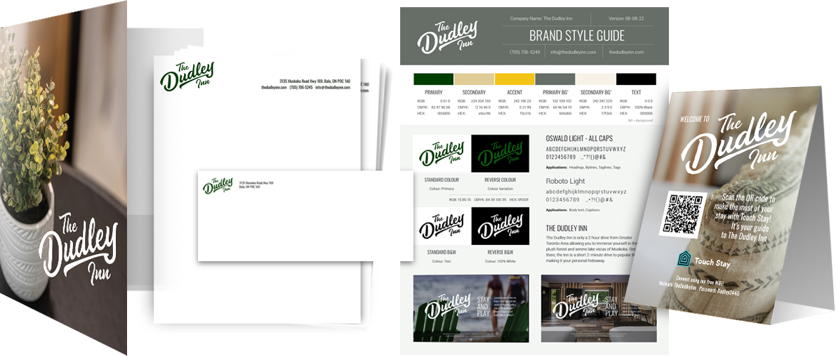
There were a number of different print assets that went into the initial branding for The Dudley Inn. On the client side, there are business cards and the brand guide. The guest-facing assets consists of presentation folders, and desk tent cards with a QR code linking to information about how to get the most out of your stay. The stationery is for both guests and the client.
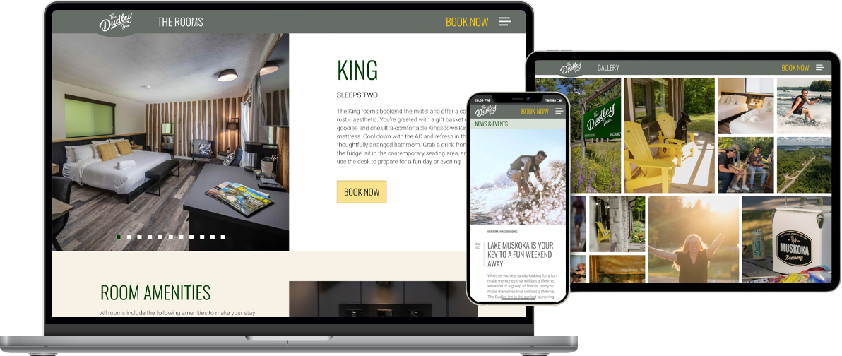
The Dudley Inn website takes site visitors on a tour of the rooms, a gallery of photos of the inn and the Muskoka area, News & Events, and more. The handsome website was integrated with the Cloudbeds third-party booking system, hosted separately.
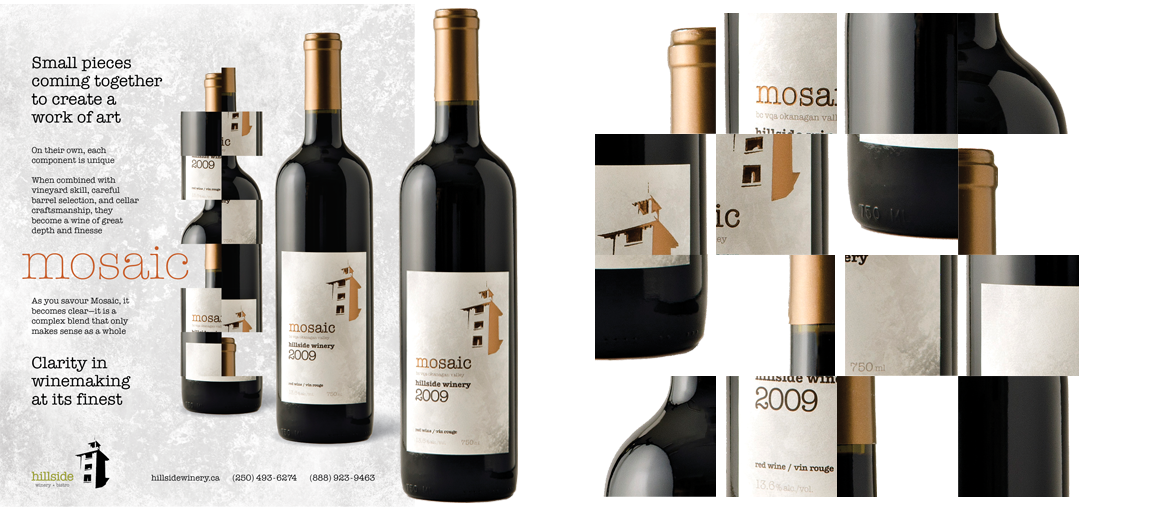
I partnered with Hillside Winery for 9 years. When they approached me they were looking for a complete rebrand from the ground up. They wanted the new brand to reflect the rustic nature of the Naramata-based winery.
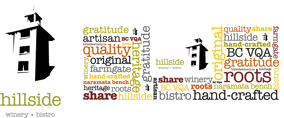
We knew the iconic tower on the Hillside property would play a large role in the visual identity. We also wanted to capture the rustic aspect of the client’s desire to be prevalent. To this end, an organic, hand-drawn logo was produced. We paired that with a colour palette and visual treatments that replicate the plaster and exposed wood wall treatments seen in the interior of the winery, tasting rooms, and restaurant.
In addition to the assets presented in the tabs above, we produced the following brand assets:
Hillside Winery didn’t need us to help sell their wonderful wines. What they were most pleased with was that every aspect of their business had a visual consistency that reflected the physical property and the quality of their offerings.
Scroll through the tabs above to see the assets forming the basis of the Hillside brand during our partnership.
The stacked logo is pictured here featuring the iconic Hillside Winery tower. We wanted a hand-drawn, simple shape that made use of positive and negative space. The wine bottle band produced for the rebrand launch media kit features the landscape logo. Also developed:
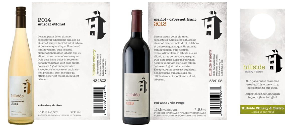
The wine bottle labels were the staple print pieces for the Hillside Winery brand. Pictured are the 2014 Muscat Ottonel and the 2013 Merlot Malbec labels before the descriptors were written by the winemaker. The Muscat features the copper metallic the client decided would best suit this limited run.
A label had to be produced for each of their ~40 varietals each year.
Also pictured is the neck tag produced for retail use.
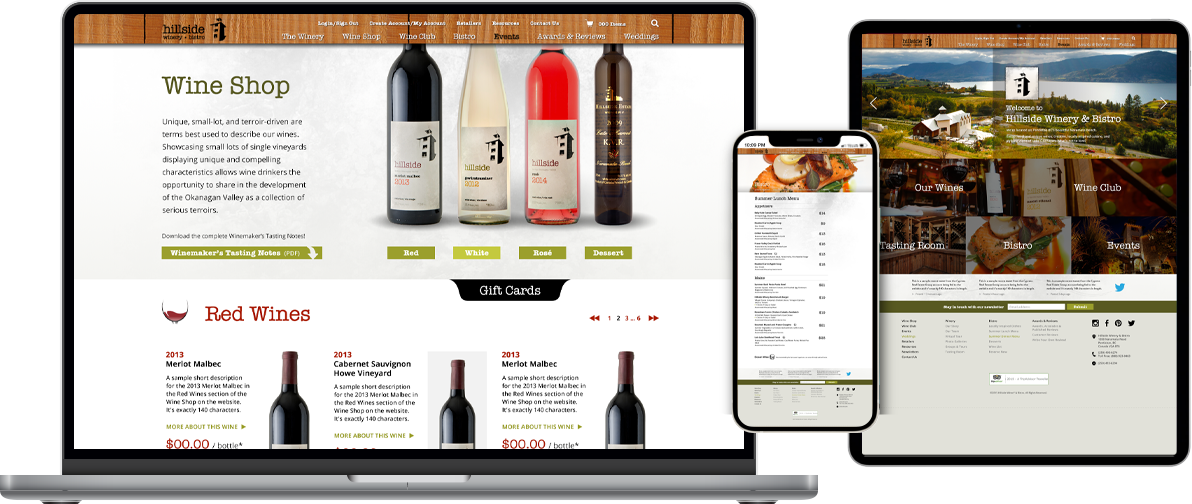
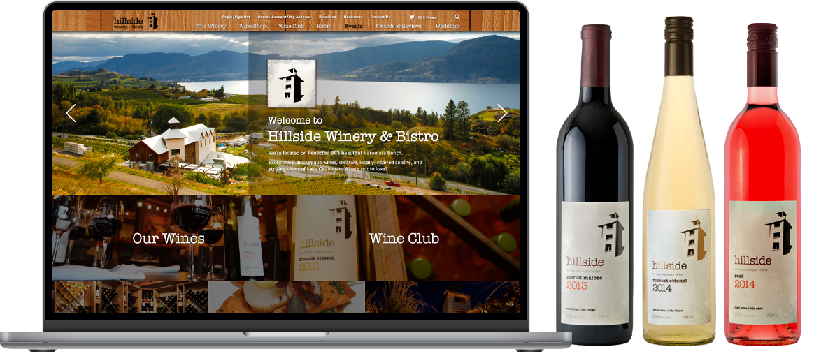
Over the course of our partnership, we designed and managed the development of three eCommerce websites for Hillside Winery: two for the main Hillside website, and one specialty site for a limited wine release accompanying a musical event. Through these sites users could purchase wine, tour the winery, reserve tours, lunches, dinners, and even weddings.
Pictured is the last site built in 2017.
A print ad for Vault Magazine. Other publications we designed ads for:
The next step for Steve Forsythe after owning Vancouver’s beloved Railway Club, was Off The Rail Brewing Co. with it’s neat play on the previous business name. A proud supporter of local artists in all their forms, Steve regularly brings in their works to exhibit in the onsite tasting room, and to design their packaging–in this case, the designs for two different autumn seasonal beer selections.
Designs were produced for 650ml bomber bottles and for 473ml cans. Four labels were produced for each of the two years’ seasons. The designs needed to be quite different from each other, but with a consistent placement of the client’s Off The Rail logo. Each of the two seasons also needed to have distinctly different styling. For the first season we opted for artistic collage-style designs with a focus on typography treatments. The second season saw a more playful approach to the four brews for that year.
Like with Hillside Winery, Off The Rail didn’t need us to help sell beer. However they continued to sell well for as long as the brews lasted. The second season sold so well we didn’t even get to try three of the four flavours.
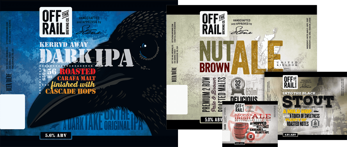
The idea here was to create an autumn motif, but to stay away from clichéd imagery of leaves, trees, pumpkins, etc. We sat down with Off The Rail and landed on certain keywords, which translated to imagery and symbols invoking darkness and timelessness. These images, combined with contemporary typography treatments in warm, autumnal colours looked as natural as could be on the shelves at local retailers.
Shown above are the labels for the 650ml bomber bottles. Designs were also produced for 473ml cans.
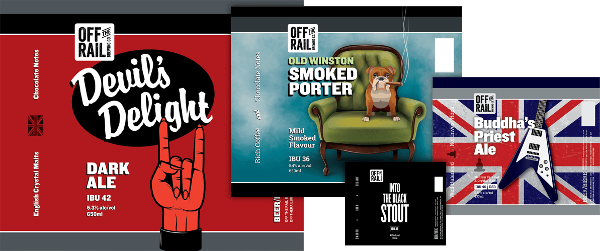
The second season saw a shift in the direction of the fall seasonal beer labels. The idea was to maintain the dark theme from the first season we designed the year before, but to get a bit more playful both in the naming of the brews and the label designs. With input from Off The Rail we decided on specific palettes and symbol-driven imagery.
Shown above are the labels for the 650ml bomber bottles. Designs were also produced for 473ml cans.
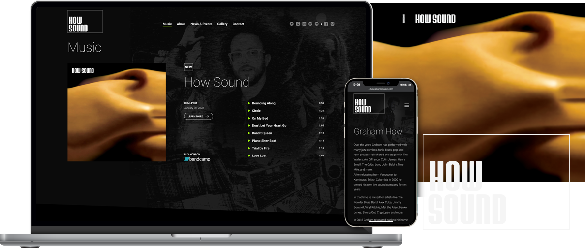
Music producer Graham How is How Sound. What started with his own love of music, audio production, and everything related to sound eventually evolved into recording and producing his own music on his own label, How Sound Music. Now to get it out there!
A new font was designed for this project and makes up the logo, and a new website that showcases the artists and the music was developed. The latter contains links to social media, and streaming platforms that play How Sound’s tunes. Other promotional materials were produced for industry events and association accreditation and membership applications.
How Sound has played several venues and events, was accepted into MAPL and SOCAN, and has sold digital and physical copies of the first album though Bandcamp and word of mouth.
Sidebar: Our artist Jamie provided some of the drum tracks on this album and is currently recording with Graham for the second album.

The How Sound logo is a wordmark featuring the How Sound typeface, for which we created the entire alphabet especially for this brand. The wordmark appears both with and without the box, which is shown here at its minimum sizing in relation to the wordmark. The box is variable and can be sized according to context/placement.
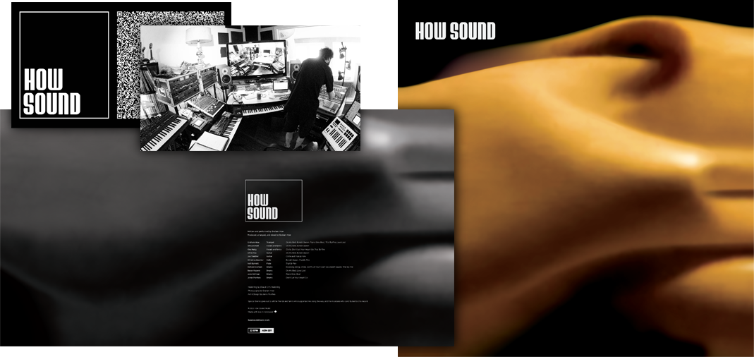
There is a considerable print component to the How Sound brand. we designed the album covers for vinyl and CD releases and used Graham’s photography as the base imagery.
Additional assets include promotional material such as one sheets for broadcast and festival submissions, press kits, QR code cards for How Sound’s LinkTree, embroidered patches, stickers, gig posters, etc.
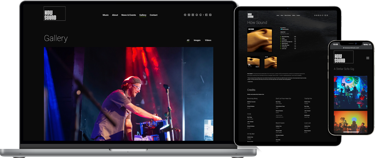
The website acts as the main portal for everything How Sound. Visitors can find links to all the streaming and purchasing platforms on which How Sound is available, and information on the latest release right from the home page. Once more music is released, this page will also act as a discography.
The News & Events page will feature write-ups about performances, music releases, etc. In the Gallery, visitors can find images and videos. The site also offers the ability to download the How Sound one sheet, and request a press kit (EPK).
There are two main goals for the site. The first is to expose visitors to the music so those who enjoy it can easily stream or make a purchase. The second is to offer information and links to booking agencies for shows and festivals, streaming platforms, broadcast, etc.
The DID team has 50+ years of experience between us in helping B2B and B2C clients in a wide variety of industries. Through this experience we’ve developed processes that allow us to produce solid brand strategies and great looking designs – all within your budget of course – to help your brand stand out.
In a general sense, here’s what we do, and how we do it.
Three Steps To Success
There is no cookie-cutter process here. I work closely with you and your team, diving deep into your company, competition, and industry to produce sustainable short-term and long-term strategies.
I offer innovative design, technical expertise, and a keen comprehension of the media landscape to build a solid brand strategy that improves upon your current success and supports your future goals.
Brand development goes way beyond just designing a beautiful logo, it involves capturing the company culture and embedding the brand image into the societal consciousness with a look and voice that reflects the values and goals of your business.
From complete company rebrands to single product and service lines, I develop a brand ethos that aligns with the marketplace and stands out amongst the competition.
Your success is my success. I recognize early what is already working and that becomes the point from which I build.
When I do my company assessment I first listen to your needs, then I learn about prior pitfalls. This information, combined with my experience, allows me to produce a set of key performance indicators (KPIs) that show real world results. Needless to say, this data proves invaluable for future campaigns.
Brand Strategy
Logo, Graphic, Interactive, & Packaging Design
Web & Application Development
Social Media Design
Photography
Drop me a line so we can start designing and developing your visually impactful new brand, or refresh your existing brand.
I’d be happy to hear from you and will do my best to respond within 24 hours.
Everyone involved with DID is a music fan. If you’ve ever heard music (we highly recommend it), it’s worth noting some of the most successful popular artists have been power trios; think Rush, Tony Williams Lifetime, The Police, ZZ Top, Yeah Yeah Yeahs and more. In a trio, each person brings their unique expertise as a complement to the others in the group–or in our case–the team. Below is the power trio that makes up DID, and those others who occasionally contribute to our work.

Jamie has been a creative person since he discovered at a young age crayons were more than just delicious.
A graduate of Vancouver Film School, he spent his early years in design with agencies both local and remote. He started DID as Donkey Ink Design in the early aughts, and in the time since he’s worked with a diverse range of clients including Pace Solutions, Vancouver Canucks, Nero AG, Hewlett Packard and a host of others.
His interests are design, drums, dogs, vans, hoodies, and cookies. The Rubik’s Cube held his attention for a while, but once solved he was over it.

Derek is a career student and a business journeyman.
Although commonly known as a front-end developer, he has developed proprietary systems that power daily operations for industry leaders from film to education. He enjoys learning about the business intricacies and design challenges that shape our everyday lives.
Derek’s loves adventure travelling. He’s backpacked to across China to Tibet, slept from table to table in Filipino slums, and been a vagabond in Japan. Man’s got stories.

After writing television commercials for CNN, Comedy Central, ESPN, as well as ad campaigns for major clients from pharmaceutical companies to sports franchises, Jeremy moved into public relations and marketing communications for the digital space.
Working with B2B clients on a North American and global scale, he produces targeted web content, delightful copy, and ghost-writes articles. The goal is to shape a brand’s narrative, build industry authority, and bring clarity to complicated technical concepts.
Jeremy is also hilarious.
Almost all musical acts have those pieces of work requiring additional elements that involve calling in a few session players. My work is no different.
Graham How
Photography
You’re in a discovery process, and we’d like to ensure you walk away from our initial contact having some insight to the process, and perhaps even some great ideas! Drop us a line and we’ll do our best to respond within 24 hours.
© 2026 Copyright Donkey Ink & Digital. All rights reserved.
DID gratefully acknowledges that the unceded traditional territories of the xʷməθkʷəy̓əm (Musqueam), Sḵwx̱wú7mesh (Squamish), and səlilwətaɬ (Tsleil-Waututh) Nations are shared with us.